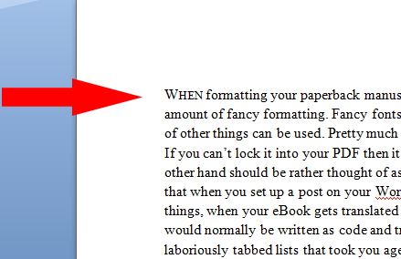
WHEN formatting your paperback manuscript for CreateSpace you can get away with a fair amount of fancy formatting. Fancy fonts, dropcaps, inserted widgets, bullets, tables, and all sorts of other things can be used. Pretty much if it’s locked into your PDF it will appear in your book. If you can’t lock it into your PDF then it won’t appear in your paperback. A Kindle eBook on the other hand should be rather thought of as an HTML page – just like a web page. The same way that when you set up a post on your WordPress blog various HTML codes are used for different things, when your eBook gets translated into HTML for publishing it will take anything that would normally be written as code and try to use that, often with disastrous results – rather than the gorgeous bullet list or laboriously tabbed lists that took you ages to get just right.
Word will insert all sorts of hidden formatting as you type, and if you ever try to convert a manuscript already formatted with all sorts of lovely things for CreateSpace you could (very probably will) end up with a nasty hot mess, especially on older Kindles. We do want our eBooks to look good rather than being merely the containers for our stories and non-fiction. Traditional publishers drop the ball with this a lot more than Indie publishers. Their print books look great, but often the corresponding eBooks seem like afterthoughts. Conformity is the way to go and maybe putting in a little extra work is worth it to make sure that both versions are a pleasure to look at as well as to read.
Just a quick by the way. Writers are surprisingly different with the way they want their books set out. For instance, among many other personal choices, some like to use an em-dash for unfinished sentences, while others prefer to use an ellipse. (Remember for modern publishing, if you do use ellipses for half sentences, to insert a space between each dot.)
 Some are absolute sticklers for what is “wrong” or “right”. Very few readers are going to even notice which one you use, but they WILL notice if you use both in the same story. They’ll wonder what the difference is, and possibly get irritated at not being able to figure that out. So stick to the same things as you type, even if that means sitting down and writing out a list. That might sound a little weird, but if you’re in two minds about some of the smaller issues you could often find yourself banging away and then coming to an abrupt halt wondering what you used before. If this is the case, you can use the Find function to look for both options and change them later, but it will make your life easier in the long run to pick a horse and run with it from the beginning.
Let’s have a look at a couple of other things we can safely use in our Kindle books.
Dropcaps are lovely to use in your paper book, but not possible as yet to use for MOBI conversion. You can still pretty them up a little though. For some of the newer Kindles you can make your first words in chapters or paragraphs stand out using Small caps. Older Kindles will just convert to normal text rather than making a mess of these, so they’re quite safe. All you do is highlight the word or words you’d like to appear this way, and then click on the arrow to the right of the Font box. Select Small caps and click OK.
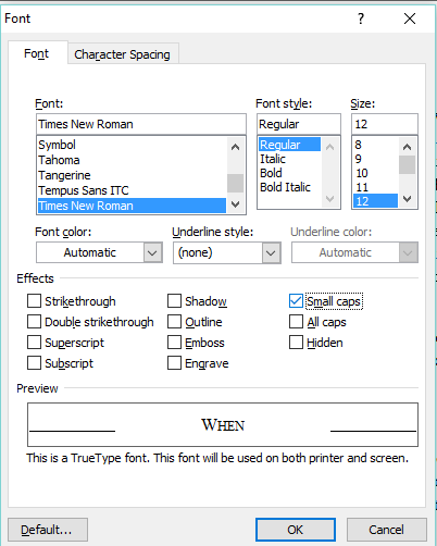
The highlighted word or words will than appear in the Small caps format.

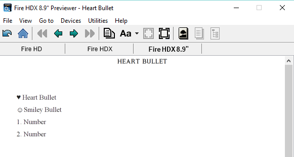
Word lists (bulleted or numbered) might convert very well for the newer Kindles, but not for the older ones. Always remember that there are a LOT of people who use older, bottom of the range Kindles, so never leave them out of your publishing decisions – put them first. Type out numbered lists rather than use the Word auto format feature. If you want a bulleted list, simply use the Insert function, type out item one, and then insert again for each item on your list.
Use your Kindle Previewer to see how they translate across Kindle devices.
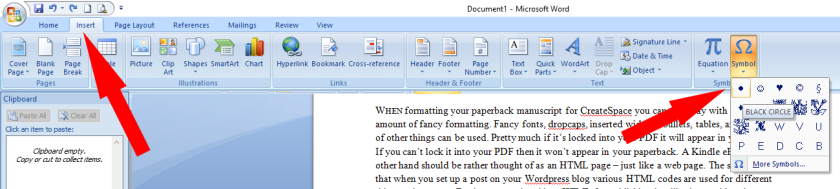
For scene breaks you could once again use the Insert function and use three bullet points, or asterisks. You could think outside the box too and Insert a small design as a picture between each break. Get the better of boring fonts on your title page by using design software such as paint.net or an online one such as Canva to design a nice title page “image” using any fancy fonts and images you like, and once again insert as an image.
Finally, I think that there is a lot of scope for using bright full colour pictures in fiction eBooks. The cost is too small to be really noticeable, such as it is in paperback publishing, but the effect can be fabulous. Insert custom sketches or images from sites such as Pixabay between each chapter. You’re bound to find relevant and beautiful pictures there – they have piles available to use for free.
Never try to rush your eBook along by trying to “double format”. Always work on completely different manuscripts taking into consideration each publishing format, and you’re bound to have great Kindle books as well as beautiful paperbacks.