One of the biggest challenges to Indies is getting a professionally published looking book when up against the costs of editing, proofreading, formatting and cover designs. If you can afford these services then foregoing them is not a good idea, but when you really can’t afford them they can mean the death of some really great literature. There are a couple of things that can help though.
Editing or Proofreading Swopsies
Rather than simply asking for Beta readers, offer to swop proofreading services. Writers have a different kind of eyeball when reading. I’ve just finished a Joanna Trollope book, professionally published by one of the big houses, professionally edited and put together, but so far I’ve found a couple of typos and instances of poorly strung together sentences. As far as the cover design is concerned, if it wasn’t for the fact that I was specifically looking for and wanting to buy a Trollope book I wouldn’t have been at all “grabbed” by the image on the cover. We automatically see things that “normal” readers don’t. We’re also all very busy, and generally prefer to choose what we read for pleasure, so we’re more likely to put the effort in to read a draft novel to look for problems if we know that the same service is on offer for one of our own babies in exchange. Offer something valuable in exchange for this valuable job.
Cover Design
I you’re going to have to do your own cover design
then do a bit of in-depth googling and watch how to videos about the way to go before you even try. Do not use Paint or the basic software on your computer. Download free programmes designed for the purpose and find out how they work. It’s a schlep for the not artistically inclined, but at the end of the day it’s better to have a slightly forgettable cover than one which is eye-wateringly terrible. One of the biggest ways to ruin a fabulous image is to use horrible fonts. When in doubt go as plain as possible with fonts. There are thousands of beautiful free images to be had online. Before you choose an image make sure to have a look at how many times it’s been downloaded, and that way you can be a little reassured that it won’t be something that you see on loads of other book covers. This isn’t a huge deal though. Even with traditionally published books, very popular images often seen on more than one bestseller. Again though, while not a dealbreaker for a bestselling author, this could be a problem for Indies.
Formatting
Once again, this is something that’s going to require work and hours of research on your part, but it’s work that is going to be worth it at the end of the day. Have a look at our previous in-depth articles and view a couple of videos on Youtube by reputable Indies who have gone before. Unprofessional formatting will be noticed by readers and can lead to bad reading experiences and will possibly be followed by bad reviews. Take note that formatting is totally different for different types of book. The Smashwords meatgrinder has a slightly terrifying reputation, but to be honest there are only a couple things to note with it once you have your eBook
formatted for Kindle. First is to get rid of all extraneous line spaces. Never, ever, have more than two consecutive line spaces for Smashwords. Make sure to have “Smashwords Edition” in your front matter, and load your book up as a clean Word document. Unfortunately there are lots of disappointing books about how to format, but there are a couple of good ones too. A pet hate of mine are those who say “Hire a good formatter” when you get to the formatting sections. Seriously, why on earth publish a how to book without getting to the how to nitty gritty? Make sure that you have a look at the reviews before buying any how to book. They are the best indicator.
Basic formatting isn’t impossible to do, but it’s not a magical thing that will just happen without a bit of research and putting in of the time. Good rules to remember are to not format while you write. Forget about fancy fonts, bullets, page numbers and text boxes. These are anathema to Kindle books. Type your book straight out and then once you’ve formatted your paragraph indents and spacing, save different copies for each format—eBook and paperback.
Make sure that you have a NCX table of contents
for your eBook. Regardless of the chats on forums, this is a requirement by Amazon, and even if you’ve gotten away without them in your books so far, at some point their absence will be noticed and acted on.
Formatting for paper is often the most stressful thing for Indie authors. Using paid for software definitely makes the process a lot easier, but not everyone can afford it. When publishing your first book it can all seem overwhelming, but if you take the process one step at a time you’ll generally find it doable. Here are a couple of tips for newbie paperback publishers:
Book Size
Don’t automatically go for the default 6” x 9”. Consider how many pages your book has and then think about how thin or thick the end result will be. If you’re publishing a novella or something with few pages it might be a good idea to go with 5” x 8” to avoid having a really skinny result, or go bigger if it’s a massive tome.
Paper Colour
Generally cream looks better for fiction. White is best for non-fiction in most cases.
Full Colour or Black and White Text
Full colour is going to mean expensive to buy, so unless you’re publishing a book where images are the most important thing then black and white should be good enough. Remember that even one single full colour picture means that the entire book will be printed on a colour press. You could publish two versions—one colour and one black and white. You would use different ISBN numbers for each, and if you do choose to do this make sure to let potential buyers know that there are two options in the blurb section of each.
ISBN Numbers
Using your own ISBN numbers is obviously the best way to go if you can afford them, but there is no shame in using the free ones offered by CreateSpace. The only real drawback with the freebies is that you have to list CreateSpace as the publisher.
Templates
I’m not fond of templates in general, but they really can save a lot of hair pulling if you can’t face the thought of formatting yourself. They are free from CreateSpace and the most difficult task involved is a bit of copy and paste.
Margins
Once you’ve set your book size you will see your page count. Your margins can’t be set to less than 0.25 and 0.5 is recommended by CreateSpace for all four sides. Gutter margin settings depend on page count:
24 to 100 pages needs a gutter setting of 0.375
152 to 300 is 0.5
301 to 500 is 0.625
501 to 700 is 0.75
701 to 825 is 0.875
To set page size and margins go to Page Layout in Word and click on the arrow next to Page Setup. Change book size in the Paper settings and margins in the Margins settings.

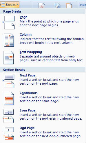
Page Breaks
With a paper book it’s important to separate sections using section breaks rather than page breaks to ensure proper page numbering. Click on Page Layout > Breaks > Next Page to insert these and make sure to remove the regular page breaks where you do put these in.
Numbering
Click into your headers and footers BEFORE inserting numbers and remove any active Link to Previous instructions in any of them where there are to be no page numbers.

Then go to the page that will have the first page number in your book and click Insert > Page Number and select your preference for positioning.
One very big tip here is that Word can play with you here and reinsert the Link to Previous instructions sometimes, so if numbers keep appearing where you don’t want them, keep calm and simply go back into relevant headers and footers and remove them again. Also double check that you have section breaks in place. Where you don’t want anything in headers and footers in certain places throughout your book, remember to click on Different First Page also in the header toolbar on the relevant pages.
With a bit of work and research you can publish fabulous and professional looking books. Happy formatting!

Reblogged this on Jo Robinson.
LikeLike
Thanks, Jo. The idea of swapping services is a great one. I’m bookmarking the page but there are limits to my technical skills. 😉
LikeLiked by 1 person
Thank you Olga! I reckon I would proof a pile of yours in exchange for one translation from you – strokes for folks. X
LikeLike
I haven’t been brave enough to try dead-tree publishing yet but your tips on margins, gutters, section breaks etc are giving me a bit of confidence. Bookmarked it all for future reference. Oh and I went the swopsies route recently with a friend who’s also a sci-fi writer. It really does make a huge difference to the quality of the final product when an actual writer does the proofing!
LikeLike
Reblogged this on Don Massenzio's Blog and commented:
Check out these self-publishing and formatting quick tips from the Lit World Interviews blog.
LikeLike
Reblogged this on Anna Dobritt — Author.
LikeLike
Reblogged this on Kim's Author Support Blog.
LikeLike
Reblogged this on Pearls Before Swine and commented:
Self-Publishing and Formatting Tips
LikeLike
Reblogged this on Chris The Story Reading Ape's Blog.
LikeLike
Thanks for this great article – I didn’t think about the NCX table of contents, it’s good to know. Have tweeted article link & posted on my writer facebook page.
LikeLike
part of my name dropped off my comment – should read Suzanne
LikeLike
This is a terrific post filled with some even better helpful tips! I’m going to re-blog it and share this information. I have self-published with CreateSpace for all five of my books, working on the sixth right now. I also used Smashwords for the first book, and yes, that was a real treat, but I survived! This business of writing and publishing is a lot of research, and then more research and applying the craft of writing, but it is so worth it. Just stick with it! Thanks for all the information!
LikeLike
Reblogged this on Life is Real…and so are the Answers.
LikeLike
I have always read and heard that unless you have a specific need, you should use “New Times Romans” fonts (12 pt.). They say this is good industry standards, easy on the eyes, and convert easily with uploading for ebooks. Would you advise otherwise?
LikeLike
I have formatted and published 4 books on Smashwords and KDP, as well as print versions on CreateSpace. I can relate to the hair-tearing aspects of formatting for print. Reading about section breaks, headers and footers and Link to Previous brought back memories of the epic struggles I went through. It was worth it, though. Thanks for a useful post; I’ve bookmarked it in case I want to go through the process again.
LikeLike
Reblogged this on Writer's Treasure Chest and commented:
Jo Robinson provides us with a fantastic article about self publishing and formatting. Thank you so much Jo. I’m more than convinced these are a gift to us Newbies. (Even though I personally think you might hear from me, once I’m there).
LikeLike
This is unbelievably helpful Jo, thank you so much for taking the time to write this. Sharing on Kyrosmagica. 🙂
LikeLike
Reblogged this on K Y R O S M A G I C A and commented:
Jo Robinson with some tips on editing and proof reading swapsies, cover design, and formatting self published books. This is on my to do list as I will be self-publishing. Lots to think about… Thank you to Jo for this fabulous article.
LikeLike