The best place to look for information on how to publish your book for paper with CreateSpace is actually in your collection of traditionally published fiction and non-fiction. In their eBook, Building Your Book for Kindle, Amazon suggests both indenting the first sentence of paragraphs and also inserting empty space between paragraphs. A lot of Indies, myself included, made the mistake of using the same system for our paper books.
It’s not the end of the world, and doesn’t look terrible, but the way it’s usually done is either using indents with no spaces between paragraphs – apart from the first paragraphs of every chapter, which are not indented, or having the spaces between, but not indenting any of the paragraphs. Amazon recommend paragraph indents of 0.5” in Kindle books, and again, a lot of us carried that figure over when we formatted for our paper books. It also doesn’t look terrible, and most readers probably won’t notice, but if you look again at your fiction collection, you’ll see that they mostly use smaller paragraph indents. To set yours, click on the little arrow to the right of the Paragraph box, and adjust the settings for both the indentation and the spacing there. Remember to select the portion of your book where you want this to happen accordingly.

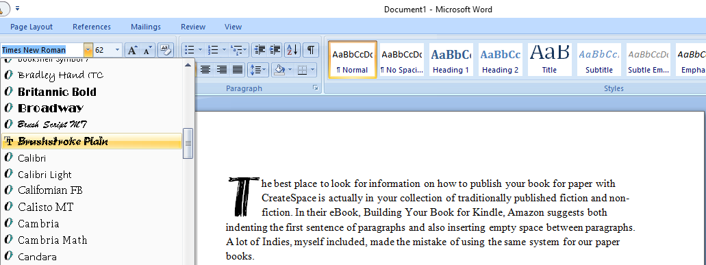
You might also fancy having a drop cap in the first paragraph of every chapter. All you do in Word is highlight the paragraph and click on Insert, then select Drop Cap and choose the style you want.

If you want to use a different font to the text for your drop cap, highlight only the first letter and select Drop Cap. Go back to your Home ribbon and open the font box. As you move down and hover over selections, you’ll see the end result appear on the page.
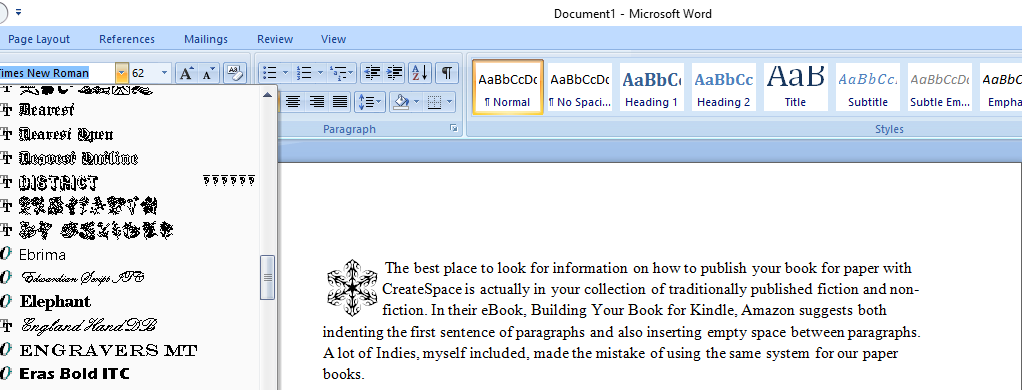
If you’re looking for free and paid for new fonts, head over to Font Squirrel and download away. Always be very sure to read the licence terms for any free font, as some require attribution. Most of these fonts will embed nicely in your PDF file for uploading to CreateSpace, and if they don’t, just don’t use them. All of the standard fonts that come with Word will work great. You could also use Wingdings or other font illustrations as a drop cap with a space after it and begin the paragraph normally.

Reblogged this on Jo Robinson.
LikeLike
Thanks for the tips, Jo
LikeLiked by 1 person
Thank you Olga. 🙂
LikeLike
Great info, Jo~~
LikeLiked by 1 person
Thanks Jet. 🙂
LikeLike
Thanks so much for this. I’m trying to format my novel now, and having a heck of a time. This explains so much. 😀
LikeLiked by 1 person
Pleasure Linda. 🙂 If you get stuck with anything feel free to zoom over an email to me jorobinson176 at gmail dot com.
LikeLike
Thanks so much!! 😀
LikeLiked by 1 person
Pleasure! 🙂
LikeLiked by 1 person
Reblogged this on Chris The Story Reading Ape's Blog and commented:
More great information and advice from Author Jo Robinson
(click the Indie Author Support Services Logo to see what else Jo can do for you)
😀
LikeLiked by 1 person
Thanks for sharing Chris! 🙂
LikeLiked by 1 person
Very welcome Jo – your posts are always worth sharing 👍😃😘
LikeLike
Reblogged this on Smorgasbord – Variety is the spice of life and commented:
Jo Robinson has been busy today with a post on Lit World Interviews.. more of her expertise on the subject of publishing your book on CreateSpace.
LikeLiked by 2 people
Thanks for sharing Sally! 🙂
LikeLiked by 1 person
My pleasure..xoxo
LikeLiked by 1 person
For those of us who are still using older versions of Word, “Drop Cap” is on the Format menu.
LikeLiked by 1 person
Thank you Christine! Which version do you use?
LikeLike
I use 2003. In addition, when I’m forced to deal with later versions of MS Office products, I use “compatibility mode,” which disables some of the worst of the ways that the developers “fixed” software that wasn’t broken.
LikeLike
Thanks, Jo. Fascinating. I especially like the last example depending on the genre. Interesting to think about. ❤ ❤
LikeLiked by 1 person
Pleasure Tess! I’m hoping to get a bit of time to carry updating my print books – trying to make my own font now and adding maps to the sci-fi. ❤ 🙂 ❤
LikeLike
Love the dropped cap bit – didn’t know you could do that so easily.
LikeLiked by 1 person
They’re really easy – fun too. 🙂
LikeLiked by 1 person
Reblogged this on Anita Dawes & Jaye Marie.
LikeLiked by 2 people
Thanks for sharing Anita! 🙂
LikeLike
I’ve learned this hit or miss! I do like the dropped caps and the variety of fleurons (I like to change them up!) The one thing I would recommend that users check their margins carefully. I had to widen the inner margin of each page because the binding swallowed the words on that margin. Thanks so much, Olga!
LikeLiked by 2 people
Excellent point – thanks Noelle! 🙂
LikeLike
Fantastic Jo, thanks! 🙂
LikeLiked by 1 person
Thank you Debbie! ❤
LikeLiked by 1 person
Hi Jo! I love the look of drop caps, I use them on my blog, but I’m sure I read somewhere that they can mess up the formatting for ebooks, so are best avoided. Am I imagining things?
LikeLiked by 1 person
Hi Ali! 🙂 They would look fabulous on my blog too! How do you do that? Copy and paste, or do you use the WordPress editor? They can seriously mess with Kindle formatting, although Amazon have jacked things up a bit lately so something for the future there definitely. You’re good to go pretty much with CreateSpace because everything is embedded in your PDF file. If the font can’t embed, it won’t in the PDF. ❤
LikeLiked by 1 person
I think its just the way my theme is set up. I get a lovely drop cap for my first para, and only the first paragraph. But sometimes it doesn’t seem to work, for example if I post an image at the top of the post. But then if I add a caption to the image, the first paragraph gets its drop cap. If there is no image, or a header image, I get a drop cap. I am bemused by this, so I just enjoy it when it’s there lol! My theme is Scrawl, it’s a free one, and I have to say, I love it!
LikeLike
Thanks for these tips – much obliged. @sheilamgood at Cow Pasture Chronicles
LikeLiked by 1 person
Pleasure Sheila – thanks to you! 🙂
LikeLiked by 1 person
Reblogged this on Don Massenzio's Blog.
LikeLiked by 1 person
Thanks for sharing Don! 🙂
LikeLiked by 1 person
You’re welcome
LikeLike
Very useful,thanks!
LikeLiked by 1 person
Pleasure, and thanks to you! 🙂
LikeLike
Reblogged this on Coffee in the Rain and commented:
I found this so practical and helpful for writers.
LikeLike
Reblogged this on Writer's Treasure Chest and commented:
Jo Robinson of Lit World Interviews published a blog post about “Inserting Drop Caps” which I find worth re-blogging. It’s a great help for newbies like me; and maybe a few pro’s too. 🙂
LikeLike